CTR Improvement- Top Strategies for Better Results
January 16, 2025
Customer Retention Emails- Proven Strategies for Engagement
January 22, 2025Email design is pivotal in engaging your audience, boosting conversions, and enhancing your brand’s image. Creating visually appealing and functional emails requires a blend of creativity and strategy, ensuring that your messages stand out in cluttered inboxes.
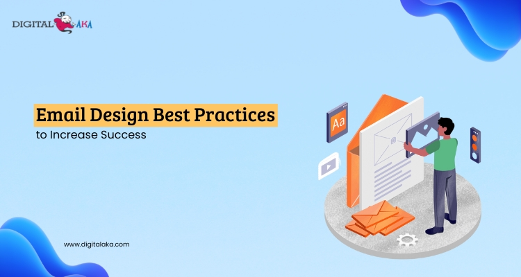
In this blog, we’ll explore email design best practices, provide insights into effectively designing email templates, and highlight the importance of optimizing for usability and aesthetic appeal.
Table of Contents
What is Email Design?
Email design is the process of creating visually appealing and user-friendly emails that effectively communicate a message. It involves arranging text, images, and other elements in a way that looks good and is easy to read. Following email design best practices, such as using clear layouts, attractive colors, readable fonts, and responsive designs, ensures that the email catches the reader’s attention and encourages them to take action, like clicking a link or making a purchase.
The goal is to make the email professional and engaging while keeping it simple and easy to understand. These best practices help businesses connect with their audience and achieve their marketing or communication goals.
Pricing
| Trail Plan | Standard Plan | Premium Plan | Professional Plan |
| $50 | $145 | $185 | $225 |
| Sending Limit | Sending Limit | Sending Limit | Sending Limit |
| 1000 Emails/Hour | 1500 Emails/Hour | 3000 Emails/Hour | 5000 Emails/Hour |
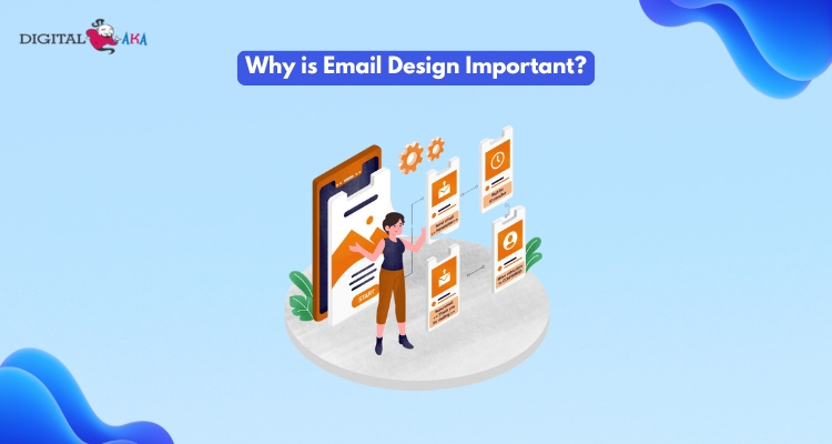
Why is Email Design Important?
Here are the key reasons why Email Design is important:
1. Improves Communication: A well-designed email ensures your message is clear, professional, and easy to understand. Thoughtful design email content grabs attention and helps achieve your goals, such as clicks or purchases.
2. Follows Best Practices: Using email design best practices ensures your emails are visually appealing and functional. This includes simple layouts, readable fonts, responsive designs, and relevant images, creating a better experience for readers.
3. Builds Trust: Emails that follow best practices for email design demonstrate quality and professionalism. This builds credibility and strengthens your relationship with your audience.
4. Enhances Functionality: A clear, attractive email design makes it easy for readers to navigate, find key information, and take action, such as clicking links or completing forms.
5. Supports Mobile Optimization: Many people check emails on their smartphones. A responsive design ensures your email looks great on any device, helping you connect with more users effectively.
6. Increases Engagement: By focusing on email design best practices, you create emails that are more likely to be read and acted upon, leading to better engagement and higher success rates for campaigns.
5 Key Components of Effective Email Design
Here are the five key components and their subpoints:
1. Clear and Simple Layout
A clean layout ensures your message is easy to understand.
- Organized structure: Divide your content into sections with headers.
- Minimal text: Avoid long paragraphs; keep them concise.
- Clutter-free design: Remove unnecessary elements to maintain focus.
2. Mobile-Friendly Design
A responsive design email works well on all devices.
- Responsive templates: Use layouts that automatically adjust to screen size.
- Font size and buttons: Ensure fonts are legible and buttons are easy to tap.
- Previews: Test emails on mobile devices before sending.
3. Engaging Visuals
Appealing visuals make your email stand out.
- High-quality images: Use clear, professional images relevant to your content.
- Color scheme: Pick colors that align with your brand and are easy on the eyes.
- Balanced content: Avoid overcrowding with too many visuals.
4. Strong Call-to-Action (CTA)
Encourage your readers to take action effectively.
- Clear wording: Use action-oriented phrases like “Buy Now” or “Sign Up.”
- Strategic placement: Place CTAs prominently in the email.
- Contrast colors: Make the CTA button stand out with bold, contrasting colors.
5. Personalization
Personalized content improves engagement.
- Use names: Address recipients by their names in the email.
- Tailored recommendations: Suggest products or services based on their preferences.
- Behavioral triggers: Send emails based on specific user actions, like a recent purchase.
Best Practices for Email Design
Good email design is key to engaging people, boosting brand recognition, and increasing action. Email personalization helps make emails feel special. Here are 10 tips to improve your email campaigns.
1. Prioritize Mobile-Friendly Design
More than half of all emails are opened on mobile devices, making it essential for your email design to be mobile-responsive.
- Use responsive email templates: A responsive design adjusts the layout of the email to fit the screen size of the device, whether it’s a smartphone, tablet, or desktop.
- Single-column layout: A single-column design ensures the email looks clean and readable across various devices.
- Touch-friendly buttons: Make sure that buttons are large enough to be tapped easily on mobile screens, providing a better user experience.
By focusing on mobile-friendly design, you’re ensuring that your emails are easily accessible and readable by a wider audience.
2. Keep the Layout Clean and Simple
One of the most important email design best practices is to maintain a clean and simple layout. Overly complicated designs can confuse or overwhelm readers, causing them to abandon the email.
- White space: Use plenty of white space to give your content room to breathe and make it easier for readers to focus on key messages.
- Logical flow: Organize content in a way that guides the reader through the email, typically starting with a headline, followed by body text, and ending with a clear call-to-action (CTA).
- Clear hierarchy: Use headings, subheadings, and bullet points to break up text and make information easier to digest.
A clutter-free layout makes it easier for your audience to understand your message and take action.
3. Use Compelling Subject Lines and Preheaders
Your email’s subject line and preheader text are the first things recipients see, so they need to be enticing.
- Subject lines: Craft subject lines that grab attention, spark curiosity, and encourage recipients to open the email. Keep it concise and relevant to the content.
- Preheader text: This is the snippet of text that appears below or next to the subject line in the inbox. Use it to complement the subject line and give additional context to the email’s content.
These elements are vital for increasing your email open rates and engaging your audience from the start.
4. Use Eye-Catching Visuals
Incorporating high-quality images and visuals into your email design helps draw the reader’s attention and make your email more engaging.
- Relevant images: Choose images that support the email content and help reinforce your message. Avoid using too many images, as they can slow down the email load time.
- Brand consistency: Ensure that the images and graphics align with your brand’s visual identity, including colors, fonts, and logo placement.
- Alt text: Always add alt text for images in case they don’t load properly. This ensures that recipients still get the key message.
Visuals are essential for capturing interest and enhancing the overall aesthetic of your email.
5. Optimize for Accessibility
A well-designed email should be accessible to everyone, including people with disabilities. Follow these best practices for email design to ensure accessibility:
- Use readable fonts: Stick to easy-to-read fonts like Arial, Helvetica, or Georgia, and avoid overly decorative fonts.
- Contrast: Make sure there is enough contrast between the text and background to ensure readability for people with vision impairments.
- Alt text for images: Provide descriptive alt text for images so that screen readers can convey the message to visually impaired users.
- Accessible buttons: Ensure buttons are large enough to be clicked easily and have clear, descriptive labels.
By focusing on accessibility, you’re ensuring your emails can reach a broader audience, including those with visual impairments.
6. Craft Clear and Engaging CTAs
Your call-to-action (CTA) is a key part of your email design because it guides recipients on what action to take next.
- Action-oriented language: Use clear and direct language like “Shop Now,” “Learn More,” or “Get Started” to encourage clicks.
- Button design: Make buttons stand out by using contrasting colors and enough size to be easily clickable.
- Single CTA per email: It’s best to have one primary CTA in each email to avoid confusion and guide the reader’s focus.
A clear and compelling CTA helps drive conversions and increases the effectiveness of your email campaign.
7. Optimize Load Time
Email design can affect the load time of your email, which is a critical factor for user experience.
- File size optimization: Compress images and files to reduce their size without compromising quality. This ensures your email loads quickly.
- Limit the use of heavy elements: Avoid using too many large images, animations, or videos that could slow down the email.
- Test load time: Before sending out your email, test its load time to ensure it opens quickly on various devices.
Fast-loading emails improve user experience and increase the likelihood that your audience will engage with the content.
8. Personalize Your Emails
Personalization is a powerful way to increase engagement and relevance in your emails.
- Use recipient names: Address recipients by their first names in the subject line or greeting to make the email feel more personal.
- Dynamic content: Tailor the content of the email based on the recipient’s preferences, location, or past interactions with your brand.
- Segmentation: Group your audience based on demographics or behavior to send them more targeted, relevant content.
Personalized emails create a stronger connection with the audience, leading to better results.
9. Test and Optimize Your Emails
Constantly testing and optimizing your email design ensures that you’re always improving your email campaigns.
- A/B testing: Run A/B tests to compare different subject lines, CTAs, layouts, or images to see what works best for your audience.
- Check different devices and email clients: Test your emails across multiple devices and email clients (like Gmail, Yahoo, and Outlook) to ensure they look great everywhere.
- Analyze performance: Track key metrics like open rates, click-through rates, and conversions to understand what is working and what needs improvement.
Regular testing helps you refine your email design and improve its effectiveness over time.
10. Maintain Consistency with Your Brand Identity
Consistency is key to building brand recognition and trust through your email campaigns.
- Brand colors: Use your brand’s colors consistently in buttons, headers, and links to create a cohesive design.
- Fonts: Stick to your brand’s font style and size to maintain consistency across all communication channels.
- Tone and voice: Ensure that the tone and language in your email match your brand’s voice and messaging.
By maintaining consistency, you strengthen your brand identity and improve overall email engagement.
5 Steps to Design Email Templates
To create effective and professional email templates, follow these 5 simple steps:
1. Plan the Structure of Your Email
Before you start with email design, think about what content you want to include and how it should be organized. Start with a clear and simple layout. Break the content into sections, such as a header, body, and footer. This helps readers easily find the information they need. Always remember, that a clean and well-organized structure is key to a successful email.
2. Choose a Responsive Design
It’s essential to design emails that look good on both computers and mobile devices. A responsive design automatically adjusts the layout based on the screen size. This is one of the best practices for email design, ensuring your emails are accessible to all users, no matter what device they use.
3. Use Readable Fonts and Colors
Choose fonts that are easy to read, especially for the body text. Stick to 1-2 font styles and ensure they are clear. For colors, use a simple color scheme that matches your brand. Avoid using too many bright or clashing colors. When you follow email design best practices, you make your emails not only visually appealing but also easy for readers to engage with.
4. Add Clear Calls-to-Action
A call-to-action (CTA) is a button or link that tells readers what to do next, such as “Shop Now” or “Learn More.” Place your CTA buttons in visible and easy-to-click spots. Make sure they stand out by using contrasting colors. Having strong CTAs is a key part of designing email that drives action from your audience.
5. Test Your Template Before Sending
Before you send out your email to the entire list, always test it. Check for broken links, and spelling mistakes, and ensure the design looks good on different devices. Testing is one of the best practices for email design, ensuring your final product is ready for your audience.
5 Common Mistakes to Avoid in Email Design
When creating emails for marketing or communication, avoiding common mistakes in email design is crucial for achieving success. Here are some mistakes to avoid:
1. Overcomplicating the Layout
A cluttered layout can confuse readers. It’s important to keep things simple and clear. Instead of cramming too much information into one email, focus on key points. Following design email best practices means using a clean, organized layout with clear sections and enough white space to make it easy to read.
2. Not Optimizing for Mobile Devices
Many people read emails on their phones, so your emails must look good on all screen sizes. Ignoring mobile optimization can lead to poor user experience and high unsubscribe rates. Email design best practices suggest creating a responsive design that adapts to different devices.
3. Using Too Many Fonts or Colors
While it’s tempting to make an email colorful and fun, using too many fonts or colors can be distracting. Stick to a small number of fonts and complementary colors that align with your brand. This creates a professional, cohesive look that keeps the focus on the message.
4. Not Including a Clear Call-to-Action
Every email should have a purpose, whether it’s to encourage a purchase, sign up for a service, or learn more. If you don’t include a clear and noticeable call-to-action (CTA), your readers may not know what to do next. Best practices for email design recommend placing a CTA button in a prominent spot, so it’s easy for readers to take action.
5. Ignoring Email Accessibility
Some readers may have visual impairments or other accessibility needs. It’s important to use readable fonts, provide text for images, and ensure proper contrast between text and background. Following email design best practices helps ensure that your email is accessible to everyone.
Measuring the Success of Your Email Design
Here are some key points to help you evaluate the success of your email design:
1. Open Rate
The open rate tells you how many people opened your email. A high open rate means your subject line and email design were effective in catching the reader’s attention. If your open rate is low, you may need to improve these aspects.
2. Click-Through Rate (CTR)
This measures how many people clicked on the links inside your email. Best practices for email design suggest using clear calls-to-action (CTAs) that stand out. A high CTR means your design email is engaging and encouraging readers to take action.
3. Bounce Rate
The bounce rate shows how many emails couldn’t be delivered. If your bounce rate is high, check if your email list is clean and up-to-date. Also, ensure your email design is not triggering spam filters.
4. Conversion Rate
This measures how many people took the desired action after clicking on your email (e.g., making a purchase, signing up, etc.). Using email design best practices to create a simple, clear, and persuasive design can help boost conversions.
5. Unsubscribe Rate
The unsubscribe rate tells you how many people decided to stop receiving your emails. If this rate is high, it could mean your content or email design is not resonating with your audience. Consider revising your approach based on feedback.
6. Engagement Rate
This tracks how actively people engage with your emails over time. Using best practices for email design, like mobile optimization and attractive visuals, can increase engagement and keep your audience interested.
7. Time Spent on Email
This shows how long people spend reading your email. If they spend more time, it means your design email is appealing and easy to read.
Conclusion
Mastering email design is both an art and a science. By following email design best practices, leveraging tools, and staying informed about trends, you can create impactful campaigns that captivate your audience and achieve your goals. Remember, a successful design email not only looks great but also drives results. Invest time in refining your approach, and watch your email marketing efforts soar.


